Tuesday, July 19, 2011

Summer Crop Connection

Let me just say that the Summer Crop Connection was not a disappointment. These ladies do an excellent job despite trials thrown their way. Good job, Deanna, Andrea and Ms. Nadine! I was excited to share my table with two ladies that meshed well with my personality, humor and skills. It was so much fun. We laughed together, ate together and made pretty things all weekend. As it turned out, I met several new friends and strengthened some relationships of ladies I barely knew. I was even asked to be included in a group of ladies that share 6x6 scrapbook pages of themselves. What an honor! I thank you and can hardly wait to start making some to hand out next time. Go "Sisters"!! One thing I really like about this event is that it is filled with fun and laughter whether you end up being productive or not. And, of course, there are contests that you can enter if you'd like to. Nothing is pushed on you and you don't have to participate if you don't want to. There is NO stress here and this makes it a wonderful time.

This event had a theme of birds and flowers. Everything was decorated so nice and I LOVE it when I first walk in and see all the pretty things they have in line for us...starting with our table. Here is what greeted us and absolutely stole my heart:


I love daisies and these little Gerbers were so happy to see us and bring us lots of joy. Thanks, Ladies, this is one of my favorite gifts! This picture is about 3 days away from the little flowers' freshest day. Actually, on the other side of the little green "stand" is a little message that reads "Welcome". I could hardly wait to set it in our camper to brighten our days as long as the little flower lived.

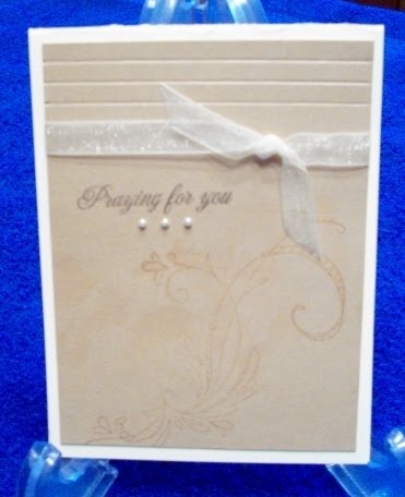
As I said above there were contests. There is one that is a Card Contest. I think they created it for me as this is all that I do. But I enjoy being around other ladies that love to play with the same toys I do, so I come to the Crop. I won First Place with this card:


In the last few days I've been enjoying making white-on-white cards. They are so elegant to me. So I pulled out my dies, embossing folder and tiny black pearls to make this. What do you think?

I want to leave you with some pictures of the event. I hope you can join us next time cause it is a WHOLE LOT OF FUN!!! Enjoy the slide made in honor of the flower theme and all my sweet friends.


Happy Stamping & Cropping!

Monday, July 11, 2011

It's Challenge Time!

This time of year is filled with weddings and I'm loving making white-on-white cards. Today I used my new Rose Creations Spellbinders Dies. I think they turned out pretty.

The card base is white with a white Textile embossed panel on top. Beautiful white lacy ribbon was wrapped around the embossed piece. A small silver foil 4" doily was gently placed on top. This little doily is so fragile and will show the least bit of bending or tearing. Luckily, mine turned out perfect. A Nestie circle was cut and embossed and placed over the center. Three different sized roses were layered with dimensionals in between them. I curled up the petals a little. A large rhinestone was placed in the center. Before placing the rose down, I punched several white leaves and taped them around the bottom of the circle, then I added the completed rose on another dimensional to the center. These cards are identical except for the last part where I used a double butterfly on one and a double dove on the other. The top was attached only to the center of the bottom butterfly or dove so I could raise the wings for a three-dimension look. The butterfly was adorned with tiny graduating pearls and the dove can now see with its tiny rhinestone eye. I rarely make two cards alike but had two weddings to do and I loved how the first one turned out so I duplicated it for the other that I needed. I enjoyed making and sharing them with you.


Paper: White
Stamps: PTI Big & Bold Wishes (inside) "Mr. & Mrs."
Ink: Memento Black (inside)
Other: Rhinestones, pearls, Textile EF, 4" Silver Doily, Lace Ribbon, MS leaf and dove punches, Rose Creation Spellbinder Dies, and lots of dimensionals

These will be submitted in several challenges:
Charisma Cards Challenge - Flower
Bloggers Challenge - Flower
Creative Craft Challenge - Flower
Frosted Design - Ribbon, rhinestones, pearls
Digi Doodle - Butterfly
Flutterby Wednesday - Butterfly
Try it on Tuesday - Flower
Hooked on Crafts - Love

Friday, July 1, 2011

Summer Card Camp Week 1

This week's Online Card Class for the Summer Card Camp (Week 1) is up-and-running. I am really enjoying each day's e-mails. There is so much information it's almost too much to take in. It's so exciting to see what all these ladies have in store for us "campers".

This card is a repeat of one I did a while back but I absolutely love it AND it fits the color combo for this week's challenge. We are to use summer colors: purple, pink, orange, sky blue and white. So needless to say, this card flew into my mind. Next thing I know...it's a repeat. But it makes me smile with all the summery lollipop colors...and just look at that warm yellow ribbon! Doesn't this just smack happiness??


Well, I had to add yellow and red. It just brought the other colors together so well. I used the Spotlight Technique. And can you believe NO stamps!

Stamps: None
Paper: Sweet (DCVW), Yellow, White
Other: Sheer yellow ribbon, Red Rhinestone (SU), clear rhinestones, dimensionals, circle Nesties, Jumbo Petite Scallop border (Spellbinders), Dotted Swiss EF

This is a real sparkly and happy card. What do you think?

Monday, May 23, 2011

Make It Monday #16

Sympathy cards are a needed part of life. Though they are not something you "want" to pick up and do, I've learned to have at least a couple of them in my stash. Sometimes there just isn't time to sit down and do one when I need it.

These two are simple and submitted for Papertrey Ink's Sympathy Card Challenge called "Make It Monday #16". Using a sympathy type phrase and one of their stamp sets, I came up with these.


This one I used a black card base with an ivory layer on top that has been lightly stamped with the Background Basics: Text Style (love this set) on the top third in Basic Gray ink. The flowers from the Rose Creations Spellbinder Dies were cut from gray cardstock and stacked and attached together with a pewter brad. The butterflies were punched using the MS Triple Butterfly Punch, a punch I keep on my desk, my fave. I didn't want anything shiny on this card since it is to declare a serene feel of sympathy to it.

I dry embossed two double lines on the bottom third leaving enough space to stamp "With Sympathy" between them. A wide piece of black grosgrain ribbon was placed around the ivory panel. Tiny black Kaiser pearls were placed in the butterfly bellies and randomly put on the card.

Stamps: PTI: Background Basics: Text Style, Out On A Limb Sentiments
Ink: Basic Gray (SU)
Paper: Basic Black, Ivory, Going Gray (SU)
Other: Black Kaiser Pearls, Pewter Brads, Martha Stewart Triple Butterfly Punch, Rose Creations Spellbinders Nestabilities, Black Grosgrain Ribbon (unk)


The last two are the same with different ribbons and ink. Using patterened paper, I covered the bottom half of a white card base folded lengthwise over. I wrapped a sheer olive colored ribbon on one and a black sheer ribbon on the other covering the patterned paper line. "Praying For You" was stamped in Always Artichoke and Memento Black. Emphasis was placed on the card's meaning.

Stamps: PTI: Damask Designs
Paper: White, Patterned Paper
Ink: Always Artichoke, Memento Black
Other: Sheer Olive Green and Black Ribbons

Sympathy cards are a necessary part of life and must be dealt with. Thanks PTI for the challenge and for visiting my blog.

Tuesday, February 22, 2011

CCEE1107

When I saw the challenge at CCEE, I knew I had to participate. I admit, this is the first time I've scored on a card. I have a board but usually use embossing folders when I want to have that dry embossed look. It is actually my favorite look and is how I started making cards. At that time, before embossing folders and Cuttlebugs, I used a stylus, light table and brass templates...it's such an elegant touch to even the simplest design.

This is a sympathy card and those, to me, should be simple in design so the focus can be centered around the person/circumstance as oppose to the card maker. In my honest opinion!

Only two cardstocks are used: SU's Very Vanilla and Creamy Caramel. Creamy Caramel anything was my favorite go-to neutral. I absolutely hate that SU retired it. I believe it is to their detriment. A flourish image was lightly stamped using Versamark ink to give a subtle image to go with the sentiment, again, trying to keep the emphasis on "Praying for you". Three lines were scored at the top. A narrow piece of ivory organdy ribbon was tied and wrapped around the panel then the sentiment was stamped in Basic Brown with three tiny pearls placed underneath it.


Stamps: Sketchy Flourishes (Inkadinkado), Damask Designs (PTI)
Paper: SU Very Vanilla and Creamy Caramel
Ink: Versamark, Basic Brown (SU)
Other: MS Scoring Board and stylus, Vanilla organdy ribbon, pearls (SU)

Hope you enjoy it.

Tuesday, February 8, 2011

Getting Crafty

I love this little crafty set by PTI. It's called Studio Style. The sentiments are perfect for the way I feel most of the time. I have a love relationship with my stamps and this set expressed me all over.

For this card, I chose to make it vintage style. I had a scrap piece of this paper that looks like it's been stitched and from there, the card took off. The base is Baja Breeze (SU). The dsp was cut in 3 strips with some space in between them and placed on the base. I colored my little jar of buttons with various Copics. Isn't that little jar just the cutest thing?? After stamping the jar and sentiment in Basic Brown (SU) they were die cut and embossed with the accompanying larger scallop layer underneath them. I got some of this old lace from a vendor at a crop I recently attended and thought it's proportion went perfect with the paper and jar size. Cute tiny buttons I've had 4-evah were placed at the bottom of the sentiment. Inside it reads: "I thought we were just collecting them!" Such a cute stamp set. The edges of the card inside and out were smudged with Antique Linen Distress Ink. Love those inks, too! What do you think??


Stamps: Studio Style
Paper: Baja Breeze, Chocolate Chip, White, DSP scrap
Ink: Antique Linen Distress Ink, Basic Brown (SU) and various Copics
Other: Spellbinders square, rectangle and scallop Nesties, old lace, old buttons.

Saturday, February 5, 2011

A Little Spring

I really enjoyed making this little card. I LOVE Papertrey Ink products and used several on this one. When purchasing the triple window die I wondered if I would ever really use it. So when I got it, the Take Three: Spring stamp set just jumped in the box with it. Well, not exactly. But now that I have it I can see it being used a lot. Gotta get more of those Take Three sets. Hey, PTI, make more stamps that fit inside this cute die!! I love that the die has soft rounded corners. As a bonus, you have the squares to use, too. Go PTI!! Getting more bang for your buck. The images in the Take Threes sets fit perfectly inside these little windows...I mean perfectly. Sorry about my finger in the picture...I couldn't get it to stay closed without something holding it that way.


The card base is Certainly Celery and has dsp on top. I did not distress it, it came that way and I have no idea from what company this is from. It was a sheet I've had for a while and only pieces were left of it. I love the look and had to have it. You know what I mean, you have these things, too. I covered the base with the dsp then die cut it using PTI's triple window die. It cut through both pieces like butter. Their dies are great. Have I told you yet that I love PTI? (Wish everything I use was theirs...BUT...it's getting there.) Take Three: Spring little birdies were stamped inside the dies. The card was closed when I did this so as to get a perfect alignment inside the cut outs. A piece of antique lace was placed across the top, then using Spellbinders heart dies I cut two graduating hearts out of PTI's wonderful felt. A light green pearl brad was placed in the center of them. They were placed at an angle on top of the lace. Clear rhinestones were used for the little birdie's eyes. Inside the little flower in this set is randomly stamped and "Celebrate You" was put in the corner. I love the way this turned out and hope you do, too.

Thank you for leaving me some love! It's always appreciated...

Stamps: Take Three: Spring (PTI)
Paper: Certainly Celery (SU), unknown dsp
Ink: Ruby Red (SU)
Other: Felt and triple window die (PTI), Spellbinders heart dies, green pearl brad (Recollections), clear rhinestones, lace.

Thursday, February 3, 2011

SC318 & CC308

Today I have a couple of cards for two challenges on Splitcoast. The first challenge is for Color Challenge 308 to use River Rock, Gray and White. The second one is for Sketch Challenge 318 on Wednesdays.


I wanted to make the first card more subtle than the second one so the main image got a softer, shadowed look. The image was lightly stamped in white pigment ink onto Basic Gray cardstock. This piece was placed in the upper left corner with paper piercing in the lower right corner. The punched butterfly was lightly stamped in River Rock with the French Script stamp. A glue dot was added only to the body of the butterfly to give it flight. Tiny silver rhinestones were added.


The second one I stamped the image more distinct with a piece of satin ribbon around the upper left corner.

Stamps: Take Three: Summer (PTI), French Script (ret. SU)
Paper: White card base, River Rock, Basic Gray
Ink: White pigment, River Rock
Accessories: Satin ribbon, MS butterfly punch, Silver Rhinestones, Paper Piercer, Rectangle Deckle Nestabilities, foam adhesive.

Though I enjoyed making these it was hard to not to more to them. I really like the CAS style. Thank you for looking.